It’s no secret that the average person’s attention span is shorter than it used to be. In fact, a recent study showed that the average human attention span has decreased from 12.5 seconds in 2000 to just 8.25 seconds today – which is even less than that of a goldfish!
Now, apply that knowledge to your website visitors and their interactions with your site. If you’re not providing them with a reason to stick around, they’re likely to click away within seconds. And that’s not good for business, is it?
Luckily, it isn’t a dead-end situation. All you need to do is tick a few boxes and give your visitors what they want, and you’ll soon see them sticking around for longer. Here’s how.
1. Reduce Load Times
Let’s start with the basics: if your website takes too long to load, people will click away before they even get a chance to see what you have to offer. In fact, 47% of consumers expect a web page to load in 2 seconds or less, and 40% will abandon a page that takes more than 3 seconds to load.
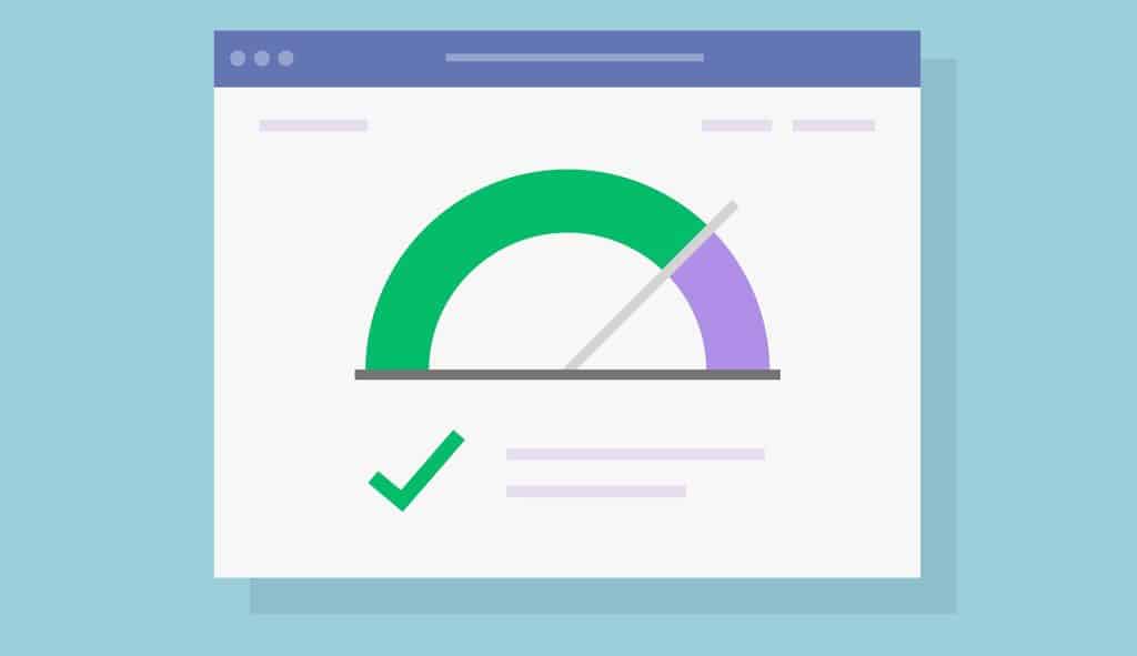
If your visitors are bouncing before they even get a chance to see what you have to offer, it’s time to take a look at your load times. Several things can impact your site’s speed, but some common culprits include large images, poorly coded themes and plugins, caching issues, and slow web hosting. Once you identify the problem, you can start working on a solution.
2. Make Your Content Easy to Read
Your blog content might be interesting and informative, but if they’re presented in a way that’s difficult to read, people are going to click away. After all, why would they want to stick around and try to decipher text that’s crammed into tiny paragraphs with no whitespace?
To make your content more reader-friendly, break it up into smaller paragraphs with plenty of whitespace. Use headlines and subheadings to organize your thoughts, and include images and other visual elements to break up the text.
The key is to make your content:
- Scannable: Use short sentences and paragraphs, and break up your text with headlines, subheadings, and bulleted lists.
- Easy to understand: Use simple language that everyone can understand. Avoid industry jargon whenever possible.
- Readable: Use a large font size (16px is ideal) and make sure the spacing between lines is large enough so that people don’t have to strain their eyes.
- Engaging: Use visual elements like images, infographics, and videos to break up your text and make your site more engaging. Also, make sure your headlines are interesting and make people want to read more.
Imagine if every website you visited was a wall of text. Not only would it be difficult to find the information you’re looking for, but you’d probably get bored and click away pretty quickly. The same is true for your website visitors – so make sure your content is easy to read and engaging, or people will click away.
3. Add Compelling CTAs
Much of your traffic will be made up of casual browsers who are just looking for information rather than people who are ready to buy what you’re selling. That’s why it’s important to have a strong call-to-action (CTA) at the end of every blog post and on other key pages of your website – to give those casual browsers a reason to take the next step with you.
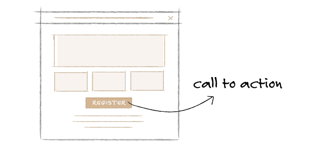
Your CTAs should be clear, concise, and compelling. They should tell visitors what you want them to do, and they should be impossible to miss. That way, instead of just clicking away, visitors will want to take action and move further down your sales funnel – all while staying on your website.
Pro Tip: If you want to make sure your readers don’t miss your CTAs, try using a popup or an exit-intent popup. That way, even if they’re about to leave your site, they’ll see your CTA before they go.
4. Use Internal Links to Guide Visitors
Internal links are hyperlinks that point to other pages on your website. They help visitors navigate your site, and they also give search engines an idea of what your site is about. But most importantly, they can keep people on your website for longer by guiding them to related content that they might be interested in.
For example, if you’re writing a blog post about gardening, you could include internal links to other posts about planting flowers, starting a vegetable garden, or choosing the right tools. As they’re moving from one post to the other, visitors will be spending more time on your site – which is precisely what you want.
5. Don’t Make Empty Promises
If you want people to stick around on your website, you need to give them what they’re looking for. Compelling headlines without matching content are a surefire way to get people clicking away – fast.
Imagine a website that claims to have the “10 Best Ways to Lose Weight Fast.” But when you click through, all you find is a list of tips that are either common sense (eat less, move more) or completely unproven (drink green tea, eat more fiber). You’d be pretty disappointed, right? And you probably wouldn’t stick around for long.
If you’re promising one thing but delivering another, people will click away in frustration and probably won’t come back.
6. Fill Your Thank You Pages With Value
Your thank you page is the perfect opportunity to keep visitors engaged with your website – but only if you use it correctly.
Many businesses make the mistake of sending people to a generic “thank you” page after they take an action, like subscribing to a newsletter or making a purchase. But all that does is give people a chance to click away from your site.
Instead, take advantage of that valuable real estate by adding even more value. Include links to your best content, special offers, or anything else that you think would be helpful or interesting to your visitors. That way, they’ll stick around even after they’ve taken the desired action.
7. Ensure Functionality
Broken links, error pages, and anything else that doesn’t work the way it’s supposed to will send people clicking away from your site in a hurry.

That’s why it’s so important to regularly check for broken links and other errors and to fix them as soon as possible. You can use a tool like Screaming Frog to crawl your website and look for any issues, or you can set up Google Search Console to get alerts whenever there’s a problem.
Also, don’t forget that such basic things make a bad user experience, so be sure to test your website on all devices and in all browsers before you launch it. No one wants to waste their time trying to figure out why a website isn’t working, so make sure everything is in tip-top shape before you start driving traffic to your site.
8. Use Exit-Intent Popups
An exit-intent popup is a form of a popup that appears when someone is about to leave your site. It’s usually triggered by the user’s mouse movement, and it can be used to keep them from leaving by offering them something of value – like a discount code, an exclusive piece of content, or a free e-book.
Exit-intent popups can be extremely effective at keeping visitors on your site, but they need to be used carefully. If they appear too soon or they’re too intrusive, people will just get annoyed and click away. But if you use them strategically, they can be a powerful tool for keeping people engaged with your site.
Put These Tips Into Action & Don’t Forget to Measure Your Results
By using these tips, you can keep people engaged with your website and reduce your bounce rate. But don’t forget that you need to track your progress to see if what you’re doing is actually working.
Install Google Analytics on your site and check your bounce rate regularly. If it’s going down, great! That means your efforts are paying off. If it’s not, take a look at your website and see if there’s anything you can change.
And finally, don’t forget that a high bounce rate isn’t always a bad thing. Just use it as one metric among many to see how people are interacting with your site. With a little trial and error, you should be able to find the perfect balance for your website.
But if you can’t pinpoint the exact problem, don’t hesitate to reach out to our team at ShiftWeb We can take a look at your site and help you figure out what’s going wrong – and how to fix it.


