
There’s no question that calls-to-action (CTAs) are a vital part of any website or marketing campaign. After all, they’re what encourage website visitors to take the next step, whether that’s subscribing to a newsletter, making a purchase signing up for a free trial, or downloading a white paper.
Unfortunately, too many businesses make the mistake of relying on their CTAs to do all the work. They create a button, slap it on their website, and hope for the best. The problem there is that CTAs are only effective if they’re actually appealing to your target audience. If not, they won’t convert as many website visitors as they could.
So if you’re not happy with your website’s conversion rate, it might be time to take a closer look at your calls-to-action. But how can you make sure they’re up to the task? Here are some tips.
1. Color Matters, So Choose Wisely
The color of your CTA button is one of the first things website visitors will notice. And believe it or not, that color can have a significant impact on whether they click it. Different colors trigger different emotions, so you need to choose wisely based on color psychology.
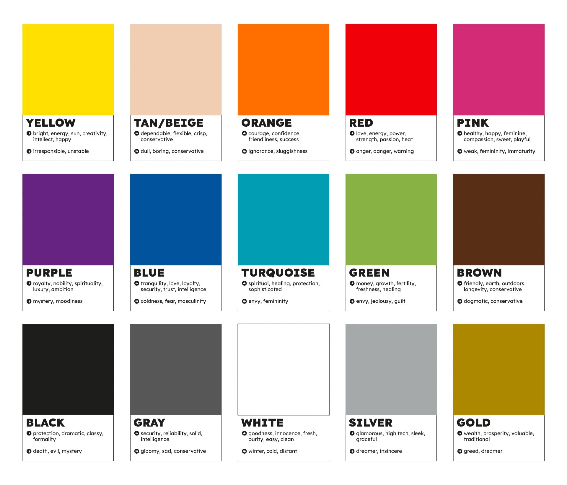
But most importantly, you need to make sure the color of your CTA button contrasts with the background color of your website. If it blends in, people are likely to miss it altogether. For instance, if your brand colors are blue and green, a red CTA button might be the best choice.
2. Size Matters Too
The size of your CTA button is another important factor to consider. It should be large enough for people to see without having to squint, but not so large that it takes up too much space on the page and distracts from the rest of the content. Aim for a size that’s big enough to stand out but not so large that it looks like it’s begging for attention.
Also, remember that there shouldn’t be other elements that compete with your CTA button for attention. For instance, if you have an image next to your button, make sure it’s not so eye-catching that it draws attention away from the CTA.
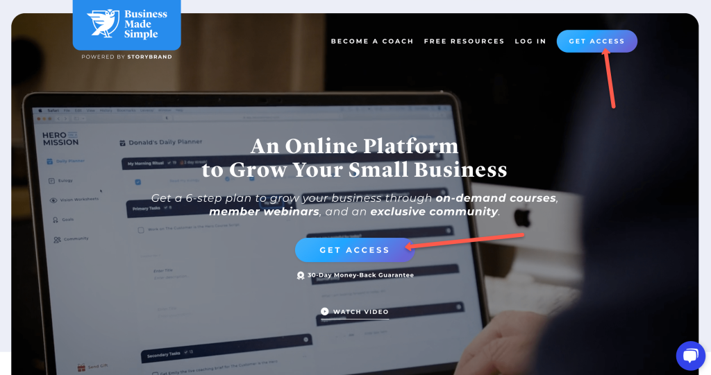
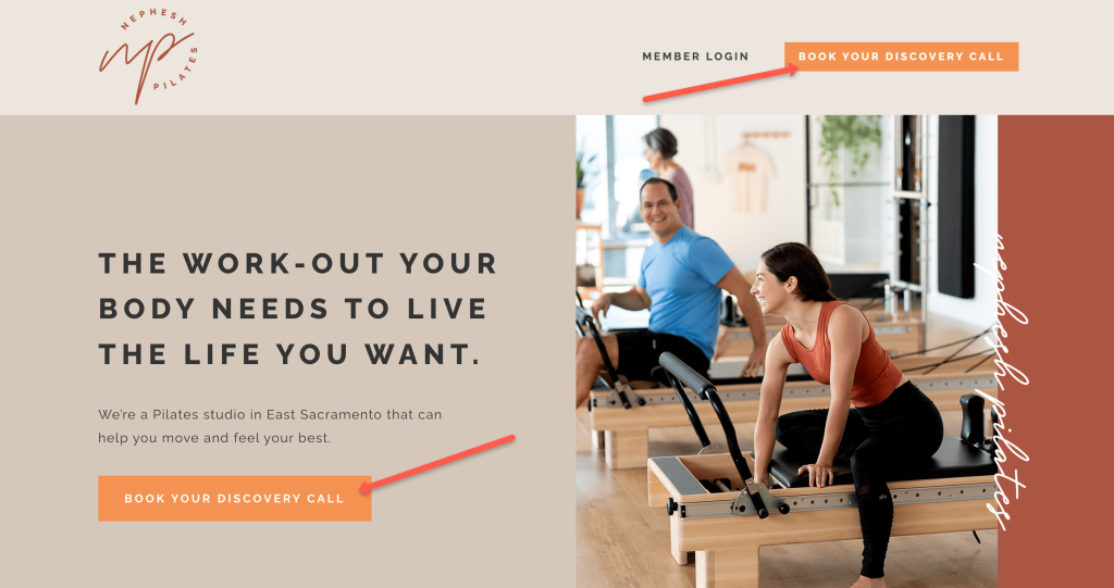
3. Consider Using Directional Cues
Directional cues are visual elements that guide people’s eyes to a specific area of the page. And when it comes to CTAs, they can be incredibly effective in getting people to notice your button and encourage them to click it.
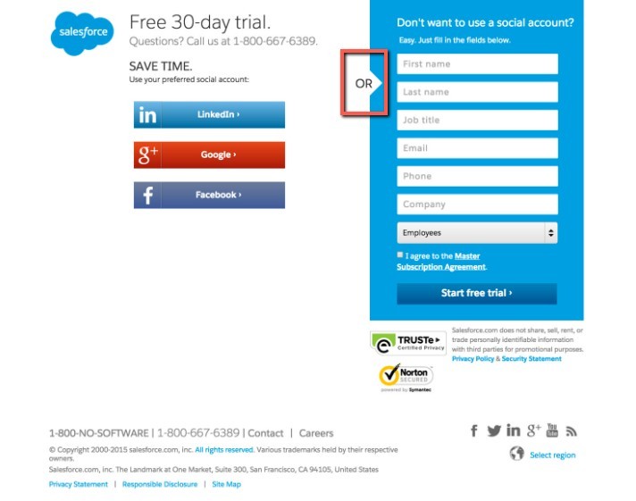
Some common directional cues include arrows and lines pointing to the CTA button. You can also use images or text to draw attention to the button. Just make sure not to go overboard.
4. Use Action-Oriented Text
The text on your CTA button should be clear, concise, and direct. It should tell people exactly what they need to do without any ambiguity. And it should use strong verbs that convey a sense of urgency.
 HubSpot
Some examples of action-oriented text include “Download Now,” “Subscribe Here,” “Get a Free Quote Today,” and “Start Your Free 30-Day Trial.” These not only tell people what to do, but they also tell them what they’ll get if they click the button.
5. Induce FOMO Feelings
Fear of missing out, or FOMO, is a powerful psychological phenomenon that can encourage people to take action. And it’s something you can use in your CTA buttons to encourage people to click.
 April Sales
There are a few different ways to induce FOMO with your CTAs. For instance, you can create a sense of urgency by using phrases like “limited time offer” or “catch it while you can.” You can also highlight the exclusive nature of your offer by using phrases like “for subscribers only” or ” VIP access.”
Other ways include:
- Adding a countdown timer.
- Using scarcity (e.g., “only 10 spots left”).
- Displaying how many people have already clicked the button.
6. Write Your CTAs in the First Person
First-person language is incredibly powerful, especially when it comes to CTAs. It’s been shown to increase conversion rates by as much as 90%.

When you use first-person language, you put yourself in the person’s shoes reading the text. You become the person who can help them achieve their goals and solve their problems. And that’s a powerful position to be in.
Some examples of first-person language include “Create My Account”, “Show Me How”, Start My Free Trial”, and similar. Simply substitute “Your” for “My.”
7. Don’t Have More Than One CTA on a Page
Most people only have the attention span of a goldfish, so don’t try to overload them with too many CTAs. If you do that, they’re likely to get lost in the shuffle and go unnoticed. Instead, stick to one CTA per page, and make sure it’s obvious what that CTA is.
And if you have multiple offers or goals, consider using different landing pages for each one. In fact, research shows that businesses with 40+ landing pages generate 12 times more leads than those with 5 or fewer.

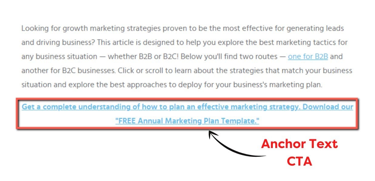
8. Try Out Anchor Text CTAs
An anchor text CTA is a text link that takes people to another page on your website, usually a landing page. They’re often used in blog posts and other content pieces to promote other offers.
Anchor text CTAs are effective because they blend in with the rest of the content, making them less intrusive than other types of CTAs.
 Weidert Group
An example of an anchor text CTA would be something like “Download a blueprint of our process here” or “Get the free ebook on XYZ topic to learn more.” When viewers click on the link, they’ll be taken to the landing page, where they can get the freebie.
9. Let User Behavior Guide the CTA Location
When it comes to CTAs, location is everything. You want to place your CTA in a spot where it’s most likely to be clicked. And you can use user behavior to help guide your decisions.
For instance, if you’re using a CTA to promote a downloadable offer, you might want to place it above the fold so people can see it as soon as they land on the page. If you’re using a CTA to promote a video, you might want to place it below the video so people can watch it and then take action.
You can certainly use data from your analytics to help you determine the best spot for your CTA. For example, you might want to track how many people click on a CTA located in the sidebar versus one located in the main content area.
Similarly, it’s also important to factor in the context of the user’s journey when it comes to “above the fold” versus “below the fold.” For example, if someone is just learning about your brand for the first time, they may not exactly be ready to take action yet. So you might want to place your CTA below the fold on your homepage.
In contrast, if someone has visited your site multiple times and they’re already familiar with your offering, they may be more likely to take action if they see a CTA “above the fold.” In that case, keeping the CTA only “below the fold” could result in lost conversions.
10. Use Social Proof to Your Advantage
Social proof is the psychological phenomenon that occurs when people are influenced by the actions of others. It’s often used to encourage people to take action, especially when it comes to buying decisions.
You can use social proof in your CTAs by displaying how many people have already clicked the button or taken advantage of the offer. You can also use testimonials, reviews, and customer logos to show that others have found value in what you’re offering.
That way, people will be more likely to take the plunge themselves.
11. Make Sure There’s Ample Breathing Room Around Your CTA Button
When it comes to CTAs, button size isn’t everything. You also need to pay attention to the spacing around the button.
If you cram the button in between a bunch of text, it’s likely to get lost and go unnoticed. But if you give it some breathing room, it will be easier for people to see and click on.
In general, you want to make sure there are about 50 pixels of space on all sides of the button. That way, it’ll stand out and be easy to spot.
11. Examples of Strong CTAs


Finally, Test, Test, Test!
At the end of the day, there’s no one-size-fits-all answer when it comes to CTAs. Like all aspects of your marketing, your CTAs should be constantly tested and tweaked to ensure they’re performing at their best.
Try different placements, colors, sizes, text, and other variables and see how people respond. Don’t be afraid to try something new – you never know what might work! And if you need help with the implementation, contact us!


