
Just last year, more than 90% of the global internet traffic came from mobile devices, and that number will only grow in the years to come.
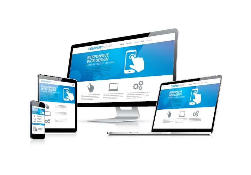
As such, it’s no longer enough for businesses to have a website that looks good on a desktop – they need to make sure their site is responsive and can be easily viewed and navigated on a mobile device. What used to be an “extra mile” is now a necessity.
After all, you don’t want to miss out on potential customers and lead them to head elsewhere just because your website isn’t mobile-friendly.
Luckily, making your website mobile-friendly doesn’t have to be complex. Just a few steps can ensure that your site can be easily viewed and navigated on any device. So if you’re ready to take your website to the next level, here’s what you need to do.
The Definition of Mobile-Friendly
When we talk about mobile-friendly websites, we’re referring to sites designed to be easily viewed and navigated on mobile devices. This includes smartphones and tablets of all sizes. What visitors see on desktops should be different from what they see on mobile devices.
For example, a desktop website might have several menu options that are all visible at once, whereas a mobile site should have a hamburger menu (a button that opens up a menu when tapped) to save space.
There are 3 main ways to make a website mobile-friendly:
- Responsive Design: A responsive website automatically adjusts to fit the screen it’s being viewed on.
- Dynamic Serving: A dynamic serving website also serves different versions of itself, depending on the device being used to view it. Unlike a responsive website, a dynamic serving site uses server-side technology to determine which version of the site to serve.
- Separate Mobile Site: You can create a separate mobile-specific website that visitors will be redirected to when they try to access your main site from a mobile device. This is generally considered the least effective option, as it can be confusing for visitors and difficult to keep up-to-date.
Having a responsive design is generally the best option for making your website mobile-friendly, as it offers the best user experience. Not to mention, search engines like Google prefer responsive websites, as they’re easier to crawl and index.
That said, if you have an existing website that’s not responsive, it’s not too late to make the switch. Now is the perfect time to do it.
Creating a Mobile-Friendly Website
Now, let’s look at what you need to do to make your website mobile-friendly.
1. Use a Responsive Theme or Template
The most important step to making your website mobile-friendly is to use a responsive WordPress theme – one that automatically adjusts its layout and design to optimal viewing on any screen size.
There are plenty of mobile-responsive themes available that you can choose from – just perform a quick search on your preferred WordPress theme marketplace, like Astra Theme or Hello Theme, using keywords such as “responsive,” “mobile-friendly,” or “adaptive.”
Once you’ve found a theme you like, install it on your WordPress site and activate it to start reaping the benefits of a responsive design. Your site will be automatically adjusted to fit smaller screens!
And if you already have a theme installed that’s not responsive, don’t worry; you can still switch to a responsive theme without losing any of your existing content.
2. Optimize Your Images
One of the significant issues with non-mobile-friendly websites is that they often have large, unoptimized images that take forever to load on a mobile device. To avoid this, make sure all the images on your website are properly sized and compressed for the web.
 Cloudflare
Remember that Google uses LCP (Largest Contentful Paint) as one of its key user experience ranking factors, so make sure your images are helping your site load faster, not slower.
When it comes to image size, you have two options:
- Image Compression: This is the process of reducing the file size of your images without affecting their quality. By compressing your images, you can make sure they load quickly on any device without sacrificing quality. Tools like TinyPNG or iLoveIMG make it easy to compress your images with just a few clicks.
- Using Third-Party Image Hosts: If you have a lot of heavy images on your website, you may want to consider using a third-party image hosting service like Imgur or Cloudinary. These services can help reduce the load time of your pages by hosting your images on their servers.
Tip: You can also apply lazy loading to your images, which loads them only when needed. This can help improve your site’s performance.
3. Forget About Pop-Ups
You know those annoying pop-ups that always seem to get in the way when you’re trying to read an article or view a website on your mobile device? Well, it turns out they’re not just annoying; they’re also bad for business.
 WordStream
While they’re great for collecting email addresses and driving conversions, pop-ups can be a major turn-off for mobile users. If you want people to stick around on your website, it’s best to ditch the pop-ups and focus on creating an unobtrusive user experience.
Google has stated that it’ll penalize websites that use disruptive interstitials – that is, pop-ups and other content that interrupt the user’s experience. So if you’re still using pop-ups on your website, now’s the time to get rid of them.

4. Space Out Your Content
When it comes to mobile web design, less is almost always more. One of the best ways to make your website mobile-friendly is to space out your content and use plenty of negative space.
Negative space is the area around your content, including margins, gutters, and white space. By using plenty of negative space, you can make sure your content is easy to read and navigate on any device.
 Asana
AsanaThis is especially applicable with links – remember to leave plenty of space around links so they can be easily clicked on a mobile device. If your links are too close together, it’s easy for users to accidentally click the wrong one. They’re clicking with their thumb, after all, not a mouse.
5. Use Large Fonts
A size of at least 14px is usually a good starting point for body website text on desktops, but have you ever tried to read that text on a mobile phone? You’ll find it’s a little smaller than you’d like.
 Faber Marketing
The same goes for headings – on a desktop, they may look fine, but on a mobile phone, they can be too small to read easily. To make your website more mobile-friendly, use large fonts that are easy to read on all devices. A size of 16px or 18px is ideal, but it also has to do with the font’s readability.
Some fonts are easier to read than others, so it’s important to choose a font that’s easy on the eyes. For example, Sans serif fonts like Arial or Helvetica are usually a good choice for body text, while serif fonts like Times New Roman or Georgia are better suited for headings.
6. Avoid Flash
While Flash may have been popular in the early days of the web, it’s now considered outdated and is no longer supported on most mobile devices. If your website still uses Flash, it’s time for an update.
 Guiding Tech
7. Shorten Forms
One of the biggest conversion killers is a long, complicated form. If you want people to fill out your form, make it short and sweet. The fewer fields there are, the more likely people are to actually complete them.
 Asana
AsanaThis is especially important on mobile devices, where users are less likely to have the time or patience to fill out a long form. Only ask for the information you absolutely need and make it as easy as possible for users to input their data.
8. Constantly Test and Improve
Making your website mobile-friendly is an ongoing process, not a one-time event. As new devices and screen sizes come out, you’ll need to constantly test your website to make sure it looks and works its best.
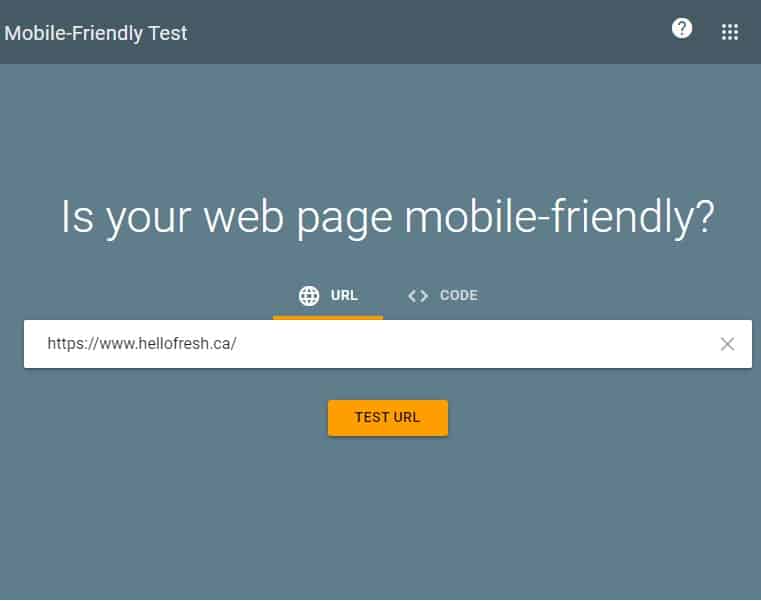 Google’s Mobile-Friendly Test
To do that, consider using Google’s Mobile-Friendly Test tool. This free tool will help you see how your website looks on a mobile device and identify any areas that need improvement. PageSpeed Insight is another great tool from Google that can help you assess your website’s mobile performance and speed. A faster website is a more mobile-friendly website.
Time to Implement These Mobile-Friendly Tips!
Making your website mobile-friendly doesn’t have to be complicated or time-consuming. By following the tips in this article, you can make sure your website is ready for the growing number of mobile users.
Still not sure where to start? Contact us today, and we’ll help you create a mobile-friendly website that’s perfect for your business.


