
When you’re launching your brand or doing a rebrand of an existing one, the font you choose to represent your brand is an important piece of the puzzle. After all, fonts form your brand’s visual foundation and help convey your message in a subtle yet impactful way.
With so many typefaces and fonts to choose from, it can be tricky to decide which one is the best for your brand. But when you know exactly what to look for and what your brand’s goals are, choosing the right font becomes much easier.
This guide will show you how to navigate the ins and outs of typography so that you can choose the font that aligns with your brand’s values and goals.
What is Typography?
Typography is the art of arranging type to make written language legible, readable, and visually appealing. It involves selecting typefaces, point sizes, line lengths, line spacing (leading), and letter spacing (tracking).
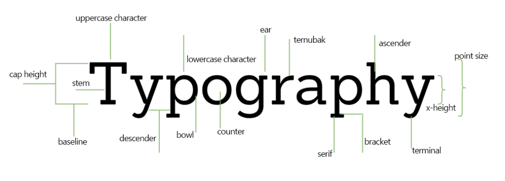
The most important part of typography is choosing the right font. A typeface or font refers to a particular design of text, while typography describes the arrangement and appearance of that text on a page or screen.
The Different Font Categories
The first thing to know about typography is that fonts can be categorized into four distinct categories: serif, sans serif, script, and decorative. Here’s an overview of each one:
Serif Fonts
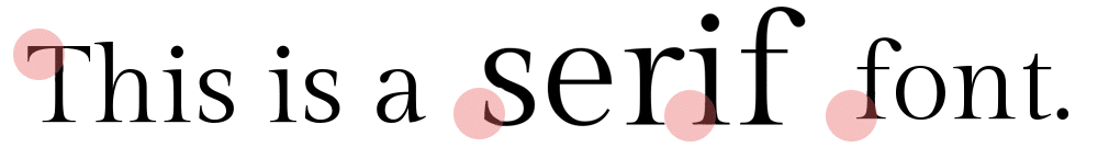
Serif fonts are those that have letters with tiny lines at the ends of their strokes and often convey a classic, timeless feel. Popular serif fonts include Times New Roman, Georgia, and Goudy Old Style.
Within Serif fonts, there are four main sub-categories:
- Oldstyle – these fonts have a gentle, rounded look and often evoke a traditional feel. An example is Garamond.
- Transitional – these fonts are less ornate than oldstyle but still carry some of the same characteristics. Examples are Times New Roman and Baskerville.
- Modern – these fonts are more angular in design and can be seen as bolder or more daring. Examples include Bodoni and Didot.
- Slab Serif – these fonts feature block-like serifs and can give a strong, contemporary feel. An example is Rockwell.
Sans Serif Fonts
Not to be confused with serif fonts, sans serif fonts (sans meaning “without” in French) are fonts that don’t have the extra lines at the end of their strokes. They often convey a more modern, clean, and minimalist feel. Popular sans serif fonts include Helvetica, Open Sans, and Arial.

Like Serif fonts, there are four main sub-categories of Sans Serif fonts:
- Grotesque – these fonts are based on early sans serif typefaces and feature more uniform letterforms. Examples include Arial and Franklin Gothic.
- Geometric – these fonts feature more angular shapes inspired by geometric forms. Examples are Century Gothic and Futura.
- Humanist – these fonts are based on calligraphic writing and feature a more organic, hand-written look. Examples include Calibri and Lucida Sans.
- Neo-Grotesque – these fonts combine elements of both geometric and humanist typefaces to create a modern yet balanced design. An example is Helvetica Neue.
Script Fonts
Script fonts are those that mimic calligraphy and often evoke a more playful, romantic, or traditional feel. Popular script fonts include Lobster, Pacifico, and Scriptina.
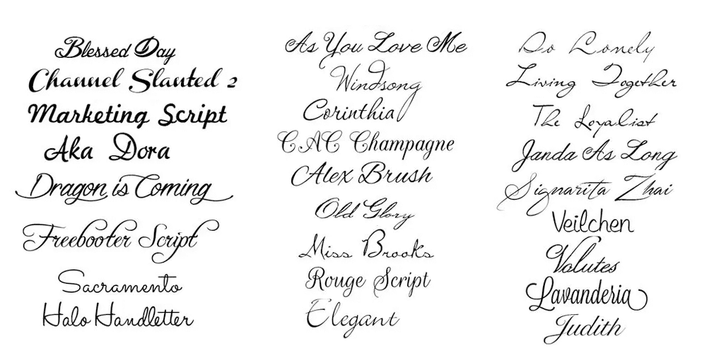
Within Script fonts, there are two main sub-categories:
- Formal – these fonts generally follow the rules of Calligraphy to create a more structured and elegant look. Examples include Edwardian Script and Vivaldi.
- Casual – these fonts are more casual in their approach, often featuring more exaggerated or curved letterforms. Examples include Brush Script, Yellowtail, and Kaufmann.
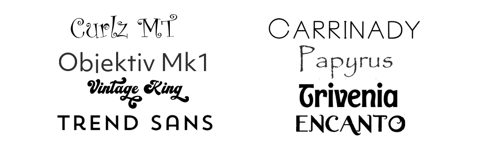
Decorative Fonts
Also known as display fonts, decorative fonts are those that stand out because of their unique styling. This type of font is often used sparingly and typically pairs best with a simpler typeface. Popular decorative fonts include Comic Sans, Curlz MT, and Papyrus. These fonts are best used for headlines or titles and should be used in moderation.

How to Pick the Right Font for Your Brand
Now that you know the different font categories, here are the steps to help you choose the right font for your brand
1. Pin Down Your Brand Identity
Before you even think about picking a font, it’s important to identify your brand’s core values and your brand personality (i.e., how it shows up in the world).
For instance, if your brand is all about creativity and self-expression, you’ll likely want to go with something more whimsical or expressive, like a script font. In contrast, a more classic serif font might be the way to go if your brand is all about reliability and trust.
2. Research Brand Fonts
Once you know what kind of font best represents your brand, it’s time to start researching which fonts might fit the bill. It’s important to do this research thoroughly so that you can be sure that the font you choose will still be relevant years down the line. Take a look at what other leading brands in your industry are using, and see what resonates with you.
Note any specific characteristics that you like, such as the weight of the font or its condensed or extended nature.
3. Dig Deep Into The Typography
Once you’ve identified a few potential fonts, it’s time to dig deep into the typography. Consider things like font size, line spacing, letter spacing, and kerning (the space between individual letters). Believe it or not, different fonts can have vastly different personalities depending on how they’re used.
Generally, fonts with thinner strokes and heavier weights tend to be more formal, whereas thicker fonts tend to be more playful and fun.
4. Cross-Check for Versatility
When choosing a font, it’s important to make sure that it works across all of your digital and print mediums. Make sure that the font is legible in both large and small sizes and that it looks great in multiple colors. Sometimes, you’ll find that a font looks great in one setting but doesn’t quite work in another.
5. Narrow Down Your Options
At this point, you should have a few fonts that meet all of your criteria. To make sure you’re making the right choice, try testing them out in different scenarios. Play around with typography settings and take a look at how they look on different backgrounds. By doing this, you can get a better sense of which font best represents your brand identity and has the most versatility.
6. Consider the Typographic Hierarchy
Next, consider how you want to use the font. Is it for body copy or headlines? What about subheadings, captions, and other elements? Make sure that your font pairings look cohesive and that they draw the viewer’s eye in an effective way—this will help ensure a visually appealing design.
The key to creating a successful typographic visual hierarchy is to consider the different font weights, sizes, and styles. For instance, if you’re using a script font for your headings, try using a sans serif font for your body copy. Similarly, if you’re using a classic serif font for your headlines, try pairing it with a modern sans serif font for your sub-headings.
Keep trying out different font combinations until you find the one that works best for your brand but also looks pleasing to the eye.
7. Always Seek Feedback
Because you’re too close to your brand, getting feedback from trusted sources is important. Ask them their opinion about the font you’ve narrowed down and see if it meets all of your criteria. It’s also a good idea to test out different variations on potential customers or just people who fit into your target demographic. You can do this through surveys, focus groups, or even A/B testing.
By involving others in the process, you can be sure that you’re making the right decision for your brand and that your chosen font will resonate with the people you’re trying to reach. You’ll often find that fresh perspectives can give you new insights into what works and what doesn’t.
8. Create a Font Kit
Once you’ve found the perfect font, it’s time to create a font kit that includes all the various weights and styles of your chosen font. Make sure to include any alternative versions (such as italic, bold, or condensed) and any special characters that you might want to use. This will be your go-to resource for all of your design projects moving forward.
By creating a comprehensive font kit, you can ensure that the typography used in your designs is always consistent and on-brand. This will help create a unified look and feel for your brand that is instantly recognizable.
How Many Fonts Should You Use?
When it comes to fonts, less is often more. Try to limit yourself to two or three fonts maximum in order to maintain a consistent look and feel across all your designs. This will help keep your design projects organized and make the process of picking out a font easier down the road.
There are two main font categories for your brand: the main font (e.g., headlines) and the secondary font (e.g., body copy). Within these categories, you can use different weights, styles, and sizes to create a variety of looks while still keeping things unified. Just remember: too many fonts can be overwhelming and make your designs look cluttered.
- Main font: This is your primary, most impactful font. It should be used in your logo and other key elements like headings and titles.
- Supporting font(s): These are secondary fonts typically used for body copy. These should complement your main font but be distinct enough to create a visual hierarchy within your designs. Ideally, you shouldn’t have more than two supporting fonts.
What About Styling Fonts?
You’ll also want to consider how you want to style your fonts. You can achieve a variety of looks simply by playing with different font weights and sizes, using italics or bold typefaces, and adding special characters like ampersands and arrows. These small touches can help take your typography to the next level.
Here’s when to use different styling types:
- Bolding: Use bold typefaces for headings or subheadings to make them stand out from the rest of the content.
- Italics: Use italicized fonts to emphasize certain words or phrases and create a more subtle emphasis.
- Capitalization: You shouldn’t use all caps for body copy, but you can use them to emphasize particular words in your headings and titles.
- Special Characters: Adding special characters like arrows, ampersands, or stars can help set apart certain elements on the page. However, be sure to use these sparingly, or it could start to look cluttered.
Fonts to Stay Away From
Before we end, it’s important to talk about the fonts you should avoid in your design projects. While there is no one-size-fits-all answer when it comes to picking out fonts, there’s been a general consensus on which fonts are overused or not very visually appealing. These are the ones that look childish, unprofessional, or simply outdated.
Stay away from Comic Sans, Papyrus, Hobo, Brush Script, Arial Black, Curlz MT, and other fonts that are more suitable for amateur designs. Instead, opt for sleek and modern-looking fonts like Helvetica, Open Sans, or Montserrat to give your brand a professional look and feel.
Pro Tip: Keep accessibility in mind when picking out fonts. Consider how the font will look to people with visual impairments and make sure it’s readable for everyone.
Ready to Start Creating Your Font Kit?
While it may seem like a daunting task, creating your own font kit is actually quite simple and fun! You’ll be surprised at how much you enjoy exploring different fonts and creating cohesive looks for your designs. And when you finally have your font kit ready, you’ll be able to quickly and easily create great-looking designs with minimal fuss.
If you need help figuring out how to get started or which fonts to use, don’t hesitate to contact our team at ShiftWeb. We’ll be happy to help you create the perfect font kit for your brand – one that certainly showcases the true essence of your business!


