
Google recently rolled out the new Core Web Vitals (CWV) update, designed to improve the speed, interactivity, and overall layout of websites and webpages. In doing so, Google is putting a greater emphasis on the user experience (UX) of websites.
If you’re a website owner, this update should be cause for celebration! After all, providing a positive UX has always been one of the key goals of effective website design and development. However, the new CWV criteria can be daunting. How can you make sure your website is up to par?
Here’s everything you need to know about the new UX criteria and how to optimize your website accordingly. Implementing these changes is essential if you want to stay in the game, so don’t let your website fall behind – read on!
What are Google’s Core Web Vitals?
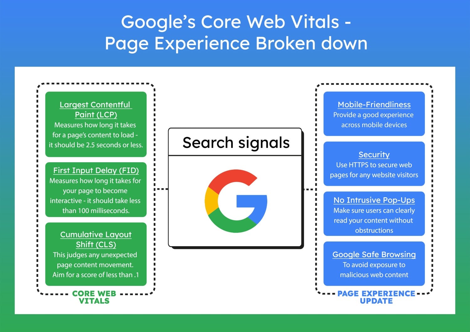
Google’s Core Web Vitals (CWV) are a set of specific factors that the company considers important in a webpage’s overall user experience. Consisting of three specific page speed and user interaction measurements, CWV is Google’s way of ensuring that all websites provide a positive user experience.
The three measurements that make up CWV are:
- Largest Contentful Paint (LCP): This measures the time it takes for the primary content of a page to be displayed. This is especially important for pages with a lot of text or images, as users want to see this information quickly.
- First Input Delay (FID): This measures the time it takes for a user to be able to interact with a page after landing on it. This is important for pages that require user input, such as forms or search boxes.
- Cumulative Layout Shift (CLS): This measures how often elements of a page move around while the page is loading. This can be especially jarring for users if they’re in the middle of trying to click on something and it suddenly moves.
What Is Page Experience?
When Google rolled out the Core Web Vitals, they became a ranking factor, meaning pages that score better on these criteria will rank higher in search results. The ranking factor itself is called Page Experience and doesn’t only encompass the three CWV factors. Page Experience also takes into four other UX metrics that have existed for a while, and they’re:
- Security: This requires websites to have a Secure Sockets Layer (SSL) certificate to be considered secure. This is important for protecting users’ information and data.
- Mobile-friendliness: This measures how well a website displays and functions on mobile devices, tablets, and other smaller screens. With more and more users accessing the internet from their phones, websites must be optimized for mobile.
- No intrusive interstitials: This metric measures how often a website displays an intrusive interstitial, which is an ad or pop-up that blocks the user from seeing the contents of the page they’re trying to view.
- Safe browsing: This is how often a website has been flagged for containing malicious, deceptive, or harmful content.
Optimizing Your Website for Google’s New UX Criteria
Now that you know what Google’s Core Web Vitals are and how they impact your website, it’s time to take some actionable steps to improve your website’s UX. Here are some tips on how to do just that:
1. Use Lazy-Loading to Improve LCP
Lazy-loading is a technique that loads content only when it’s needed. This can help improve your website’s largest contentful paint score by loading the primary content of your page first and then loading other content as the user scrolls down the page.
When you implement lazy-loading on your website, you’ll decrease users’ perception of how long it takes your page to load, as they’ll only see the content that’s immediately visible to them. This can help improve your website’s overall user experience meanwhile decreasing your bounce rate and boosting your LCP score.
To apply lazy-loading to your website, you can use a plugin like Lazy Load by WP Rocket (among others). Alternatively, you can insert the following code loading=”lazy” into image tags.
2. Compress Images and Optimize Them to Boost LCP
Image compression is the process of reducing an image’s file size without losing any quality. This can help improve your website’s largest contentful paint score by reducing the time it takes for images to load on your page. Not to mention, too large images sometimes cause pages to fail to load altogether.
To get started with this, optimize all the images on your website by resizing them to the correct dimensions according to their intended placement on the page. Then, you can compress them using a tool like TinyPNG or iLoveIMG in seconds.
This process, combined with lazy-loading, can make a significant difference in your website’s LCP score and help you reach the 2.5-second goal.
Pro Tip: When you can, avoid using images altogether and use CSS3 effects like gradients, shadows, and animations to create a visually appealing design. The fewer the images on your page, the faster it’ll load.

3. Consider Choosing a Simpler Design Theme
If you initially chose a more complex design theme for your website, it’s time to consider switching to a simpler one. Complex design themes often contain more files and code, slowing down your page’s loading time.
On the other hand, simpler themes are often lighter and faster to load, relying on layouts and fonts already in the browser. Accordingly, they require significantly less code to render properly.
If you’re not sure where to start, take a look at some of the simpler design themes on sites like ThemeForest or Mojo Themes. You can also find free themes on WordPress.org or Drupal.org.
When you do make the switch to a simpler design theme, test your website’s speed using a tool like Google PageSpeed Insights to see if there’s been an improvement.
Not only will your LCP score likely increase, but your website’s overall user experience will too. Your visitors will appreciate the faster loading time, and you’ll appreciate the improved rankings in Google search.
4. Know What Your LCP Content Is
Your website’s LCP is the largest content element visible on your page when it first loads. This could be an image, a video, a block of text, or anything else. For that reason, it’s considered a page’s main content.
Sometimes, you think you know what your LCP is, but you’re actually wrong, according to Google. To determine your actual LCP, again, use the PageSpeed Insights tool to run a speed test on your website. This will help you identify the largest content element slowing down your page, known as the MVP.
Once you know what your LCP is, optimize it – whether that means resizing it, compressing it, moving it to a different part of the page, or even removing it entirely if it’s not absolutely essential.
5. Continuously Test and Monitor Your Website’s Mobile-Friendliness
Google’s new UX criteria take into account the user’s experience on mobile devices as well as desktop computers. Understandably, people now use their mobile devices more than ever to browse the internet. Whether they’re on the go or at home, people are more likely to use their phone or tablet to look for information than use a desktop computer.
That’s why it’s more important than ever to make sure your website is mobile-friendly. You certainly don’t want to lose out on potential customers because your website is difficult to use or doesn’t display correctly on their device.
To make sure your website is mobile-friendly or see how it can be improved, your backend should be your go-to. Most website builders and CMSs have a toggle that switches between mobile and desktop view, so you can easily see how your website looks and functions on different devices.
If you’re not happy with the results, there are plenty of ways to improve your website’s mobile-friendliness, including:
- Ensuring your website has a responsive design
- Using large, easy-to-read fonts
- Minimizing the use of pop-ups
- Speeding up your website’s loading time
- Making sure clickable elements are far apart from each other
- Placing CTAs in strategic places
- Enabling Accelerated Mobile Pages (AMP)
You can also use Google’s Mobile-Friendly Test tool to get specific insights on how to improve your website for mobile users.
Once you’ve verified that your website is mobile-friendly, continuously test it using Google’s Mobile-Friendly Test tool as well as other similar tools. For instance, PageSpeed Insights also offers a Mobile tab that checks the performance of your website on mobile devices.
By continuously testing and monitoring your website’s mobile-friendliness, you can be sure that you’re providing the best possible experience for your mobile visitors, which will, in turn, help improve your website’s SEO. It’s a win-win!
And Remember, Always Keep Testing!
You now have a better understanding of Google’s new UX criteria and how to optimize your website for them. But, as with anything in SEO and digital marketing, these things are always changing. What may be considered best practice today may not be tomorrow.
That’s why the most important thing to remember when it comes to optimizing your website is to keep testing. Even if you’ve followed all of the steps in this guide, your website’s speed won’t stay optimized forever. Things like new plugins, themes, and code updates can quickly throw your website out of balance again.
For that reason, it’s important to continuously test and monitor your website’s speed, mobile-friendliness, and other UX criteria to ensure you’re providing the best possible experience for your users – and keeping Google happy.


