
Have you ever noticed how certain colors can evoke different emotional reactions in you? For example, when you see blue, do you feel calm and relaxed? What about yellow? Does it make you feel energized and hopeful? If you nodded your head in agreement, you’ve been subconsciously reacting to the psychology of colors.
These emotions you feel aren’t just in your head. Colors can affect humans both physically and emotionally. From a scientific perspective, colors are light waves that directly stimulate the brain’s visual cortex. Each color has its own distinct wavelength, which triggers different reactions in people. That means a simple color can have a lasting effect on our moods and behavior.
With that said – that makes colors a powerful tool in web design and branding. Imagine how your website, logo, or product packaging will look when it’s designed with colors that evoke the right emotions in people. That’s why successful companies invest time and money into understanding colors – because they know how to tap into the psychology of colors to create an emotional connection with their customers.
So if you want to use colors effectively in your web design and branding, it’s important to know how each color makes people feel. That’s what we’re going to explore in the rest of this article.
What Is Color Psychology?
Color psychology is the study of how different colors affect human behavior, moods, and decisions. This area of study explores the different ways that people perceive and respond to color, as well as how factors like age and cultural background affect these responses.
Today, certain colors are widely accepted to be associated with certain emotions. For example, blue is often seen as calming and peaceful, while red is seen as energizing and exciting. Similarly, green is often associated with nature and growth, while yellow is seen as cheerful and optimistic.
This kind of knowledge is invaluable for web designers, marketers, and branding professionals. By understanding the psychology of colors, you can use them to create an emotional connection with your audience that no one can take away from you.
How Marketing Makes Lucrative Use of Color Psychology Principles
The use of colors in marketing is nothing new – companies have long been using color psychology principles to influence consumer behavior and draw customers toward their brand.
But with the rise of digital media and online marketing, companies understand that different colors can have a powerful effect on how people see their brand, so they often use this knowledge to craft campaigns with specific goals in mind. In other words, they’re now able to use colors more strategically than ever before.
From web design to ads, every aspect of your digital marketing strategy can be optimized to create a compelling visual experience. By carefully selecting the right colors, you can evoke certain emotions in customers and use them to increase conversions and customer loyalty.
For instance, medicine and science brands often rely on blues, greens, and pinks to convey trustworthiness and safety – while utilities and government organizations typically opt for blues and greens in order to inspire confidence. Meanwhile, yellow is a great choice for businesses that want to evoke happiness and optimism in their customers.
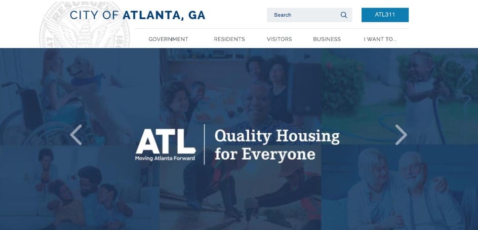 Image Source: atlantaga.gov
Aside from the emotional responses generated by certain colors, some companies also use color psychology to create brand recognition. For example, McDonald’s uses the color red to make its brand instantly recognizable. By using this strategy, they can create a strong connection between their products and customers – leading to increased sales and customer loyalty.
The idea is that, if done correctly, you can use color to create powerful experiences that will stay with customers long after they’ve interacted with your brand. That’s why understanding how colors can affect consumer behavior can be a great tool for any business that wants to increase conversions and loyalty.
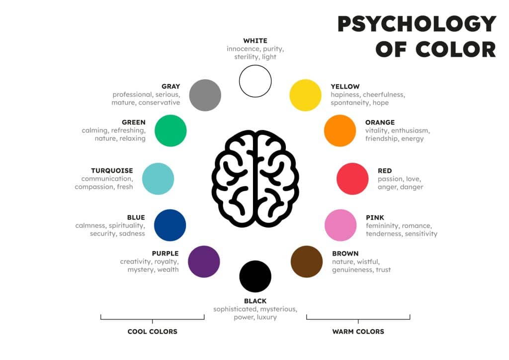
The Meanings of Colors
You’re probably intrigued now to learn what colors mean and what feelings/emotions they evoke. Here’s a rundown of the most common colors and how they make people feel. We’ll focus on the types of associations that can be used in web design and branding, so you can create an emotional connection with your customers.
White
In the web design world, there’s a lot of emphasis on the concept of “white space”, right? That’s because white is associated with freedom, cleanliness, simplicity, openness, and purity. It has a calming effect and can evoke feelings of safety and serenity. For that reason, providing your site visitors with a visual breathing room (the white space) to absorb the information on your website is a form of that “freedom” that white conveys.
The beauty of white is that it can be paired with practically any other color to evoke a certain emotion. It’s also known to be neutral and can bring balance to your design. But keep in mind that white can be difficult on the eyes when paired with true black (#000000) – so if you want a more inviting feel, go for an off-white like ivory instead.
Black
Black carries many different meanings, some of the common ones being evil, aggression, power, sophistication, and mystery. At the same time, though, it also conveys strength, authority, and elegance when it comes to the corporate world.
With colors that are this powerful, it’s important to be careful with the way you use them. Too much black in your design can be overwhelming and sinister – so keep it as an accent color or a background shade. That way, it will provide the perfect contrast for any other color you pair it with – lending a mere hint of the emotions it carries and giving off some edginess to your design.
Like white, you can also explore the different tints and shades of black to find the right balance for your design. For example, a deep charcoal gray may be more muted than pure black, but it can still convey power and sophistication.
Brown
Despite its positive connotations of dependability and ruggedness, brown is probably the least popular color for web design. Mostly, that’s because it’s hard to pair it with other colors without making the design look dull and flat. Plus, both men and women tend to dislike it, which makes it tougher to use in marketing campaigns that target a wide demographic.
But if you have a keen eye for design, there are ways to make brown work. For example, pairing warm browns (like terracotta) with cooler shades of blue can give your design an earthy look that’s still inviting. And if you want to make brown more feminine, try pairing it with blush pink or beige tones.
Blush pink, a very specific tone of nude pink that verges on beige, has become increasingly popular over the past few years. Businesses that cater to women, especially women in their 20s and 30s, often use blush as an alternative to tan or beige as a more feminine neutral color.
Red
Red is an intense color that’s associated with strong emotions like passion, energy, and excitement. That energy can be good energy (think love), but it can also be a sign of danger and aggression (think anger). Because it’s among the most visible colors in the spectrum, red is known to command attention.
For that reason, it’s often used to signify an important message – so it’s often used for calls-to-action, buttons, and other interactive elements in web design. This doesn’t mean that you should use red all over your pages, though.
Use red in moderation – too much red on your website can be overwhelming, but just the right amount can help you draw attention to the important elements on your page and create a sense of urgency.
Orange
Although its color is close to red, orange is seen differently. It’s associated with enthusiasm, cheer, warmth, and dynamic energy – but its effects are milder than red.
Orange is also often seen as a friendly, inviting color that’s perfect for creating an emotional connection with your visitors. For this reason, it’s often used in website design to make users feel welcome and encourage them to take action.
Yet, it’s worth mentioning that the consensus around orange isn’t unanimous – while some people find it invigorating, others may find it too loud and overwhelming. It’s one of those colors that you either love or hate, so make sure to use it strategically.
Yellow
As we mentioned at the beginning of the article, yellow mostly resembles hope, optimism, sunshine, and positivity – it’s a playful, cheerful color that reminds us of the warm, sunny days. But let’s not forget that in the streets, yellow is also used for warning signs and caution.
When used in web design, yellow is a great pick if you want to make elements (like buttons or call-to-actions) stand out without being too aggressive. It adds a fun element to the page and creates excitement for your visitors. It should be used sparingly, though – too much yellow can trigger a sense of overstimulation and chaos.
Far from being just a simple pigment, different shades of yellow can evoke different emotions. For example, a pastel yellow is great for creating an elegant and youthful feel, while mustard yellow can give your design a classic, retro vibe. Pick the right shade for the effect you want to achieve.
Blue
Blue is a color that’s often associated with openness, freedom, trustworthiness, security, and stability. Being the color of the sky and the sea, blue also represents depth, peace, and tranquility. As you see, it’s a color loaded with positive connotations.
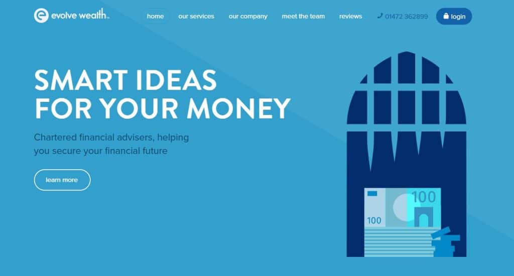 Image Source: evolvewealth.co.uk
Blue is a great choice for website design, not only because it looks good but also because it conveys trust and reliability. It’s often used as the main color of corporate websites or serious businesses (think banks) to create an impression of professionalism, credibility, and authority.
Surprisingly, however, blue doesn’t perform so well when it comes to food websites. It’s because blue has an appetite-suppressing effect, which may make visitors less likely to order any food items. So, if you’re designing a website for a food-related business, blue may not be the right choice. Otherwise, it’s a great option for many other types of websites.
Green
Green is another great color for website design, having a strong link to nature and being environmentally friendly. It can evoke feelings of peace, calmness, and relaxation – perfect for websites aimed at selling spa products or services, health & wellness, eco-friendly companies, and those related to outdoor activities.
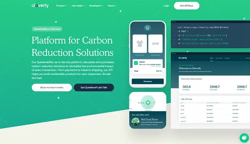 Image Source: cloverly.com
Green can also be associated with growth, money, and prosperity. As such, it’s often used in finance and investment websites to send the message of dependability and stability. It’s also a popular choice for real estate websites, corporate sites, and other online businesses.
Green is becoming increasingly popular since its mix of blue (for relaxation) and yellow (for energy) makes it the perfect color to create balance and harmony. So, if you’re looking for a calming yet energizing effect, green is your go-to hue.
Purple
While purple isn’t a color you see too often on the web, it’s an incredibly versatile hue that can be used to great effect. Associated with royalty, creativity, ambition, power, and luxury, purple is perfect for any website related to art or fashion.
Purple can also be used to create a sense of mystery or enchantment – it’s the perfect choice for websites aimed at a female audience, particularly those related to beauty or spirituality. But like orange, it can be quite polarizing – some people will adore the regal feel it gives off, while others may find it too loud and overwhelming.
What makes purple a unique color selection is that it combines red and blue – red for power and blue for stability. As such, it’s a great option for any website wanting to create an impression of opulence and sophistication. Just remember that it’ll repel male customers, so if you’re targeting a gender-balanced audience, you may want to pick another color.
Pink
Next, there’s pink. Pink is often associated with femininity, tenderness, and friendship. It has strong associations with gender, being the color of choice for many women’s products and services (think cosmetics). In lighter hues like pastel pink, it can evoke feelings of delicacy and innocence, while in more intense shades, it can seem euphoric and boisterous.
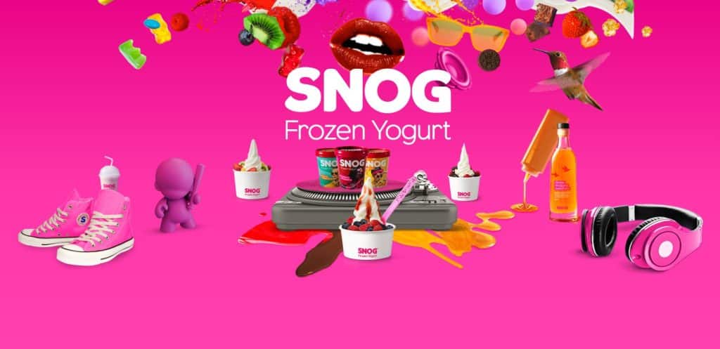
Image Source: ifancyasnog.com
Thanks to its gentle nature, pink is perfect for baby-related websites or products, as well as those related to confectionery and food. It’s also often used in health & fitness websites or any other site targeting a female audience, particularly those wanting to create an atmosphere of love and compassion.
Overall, pink can be a great color choice for any website wanting to convey warmth and friendliness – its approachable nature makes it perfect for building trust and loyalty with customers. Don’t be afraid to use it in combination with other colors to create a unique and eye-catching design.
Popular Colors – By Industry
While it can be tempting to pick the colors that you admire the most, it’s important to consider the type of industry your website is in and the kind of message you want to send out. That’s why certain colors have become popular across certain industries – they help convey their unique message and mission.
Here are some of the most popular colors used in web design and branding, broken down by industry:
- Healthcare, Medicine & Science: Blue, Green, Pink
- Utilities & Government: Blue, Green
- Recruitment: Blue, Green
- Legal & IT: Blue
- Corporate: Blue, Black
- Ecological Business & Tourism: Green, Yellow
- Human Resources & Finance: Green, Black
- Construction & Manufacturing: Black, Grey
- Fashion & Cosmetics: Red, Pink, Black, Grey
- Oil & Mining: Black
- Marketing & Tradesmen: Black, Yellow
- Automotive & Sportswear: Grey, Red
- Journalism & Technology: Grey, Yellow
- Food & Drinks: Red, Pink, Orange, Yellow
- Retail & Hardware: Red, Pink, Orange, Yellow
- Video Games & Video Streaming: Red
- Fitness & Dating: Orange
- Real Estate: Green
Of course, these are only general guidelines – there’s no one-size-fits-all when it comes to selecting the perfect color palette for your website. But by understanding the industry trends and associating certain colors to specific missions, you can create a unique look that resonates with customers in your space.
For instance, if all your competitors in the recruitment industry are using blue, consider adding another color, like green, to give your website an edge over the competition. Or, if you’re in the automotive industry and want to stand out from the crowd, don’t be afraid to add brighter colors like yellow or orange to make your website design pop. Yet, don’t go too far outside the industry norm if you want to ensure that your brand message is being communicated correctly.
Remember that these trends have been established for a reason – and by paying attention to them, you can create a website that reflects your company’s mission and values while still standing out from the competition.
The Role of Gender in Color Selection
Whenever the topic of color psychology comes up, it’s impossible not to mention gender. While it’s true that everyone has their own individual preferences, studies have shown that certain colors are associated with different genders. It’s not your standard pink for girls and blue for boys – more and more colors have come to represent both genders.
There are also overlaps in color preferences between men and women, with blue being the most popular amongst both genders (57% of men and 35% of women said it was their favorite color) and orange and brown being the least popular (22% of men and 20% of women absolutely dislike brown).
Here’s more of what the research says about the connection between gender and color:
Females
When it comes to women, their favorite colors are blue (35%), purple (23%), green (14%), red (9%) and black (6%). A small minority (less than 5%) of females said that orange, yellow, brown, grey, or white was their favorite color as well.
If there’s one takeaway to keep in mind when it comes to female color preferences, it’s that they tend to favor softer shades. Pastel colors are particularly popular amongst women, especially for website backgrounds and icons.
Males
As for men, their favorite colors are blue (57%), green (14%), black (9%) and red (7%). Fewer than 5% of males said that orange, yellow, brown, grey, or white was their favorite. Oh, and remember what we said about purple? Not a single man said it was their favorite color, so that’s further evidence of the gender divide when it comes to purple.
The takeaway here is that men prefer brighter colors than women. While pastels are popular amongst females, males often gravitate towards bolder shades such as green and red.

What About Demographics?
In today’s digital world, it’s not enough to just consider gender when selecting a color palette. You should also take into account the demographics of your target audience. Different generations have different preferences when it comes to color, so by understanding these trends, you can create a website that appeals to your target demographic.
Below are some highlights from a study on color preferences by generation:
Adults
Adults tend to prefer subdued colors over bright, stimulating ones. Their color preferences are also relatively set in stone. For example, seniors (age 65+) tend to dislike yellow and prefer blue, pink, and green. Interestingly, women in this age group grow to prefer purple more and more over time.
Teenagers
Teenagers go all-in when it comes to color. They often prefer bright, bold tones like black and neon and are more accepting of sophisticated color combinations, such as turquoise and purple, for instance. In addition, they’re more likely than other age groups to incorporate patterns and graphics into their color palette.
Kids
Young children have the brightest color preferences of all ages – literally! They love primary colors such as red, yellow, blue, orange, and green. They’d also choose a solid block of color over a pattern or image.
Again, it’s important to remember that everyone has their own individual preferences when it comes to color, but understanding the general trends can help you create a website that speaks to your target audience. Whether you’re designing for kids, adults or teenagers, having an understanding of the connection between gender and color can be a valuable tool in your arsenal.
The Combination of Colors Makes a Difference
Finally, it’s important to remember that the combination of colors you use within your website can significantly impact user experience. We all see tons of blue websites, but how each website uses that color can drastically change its look and feel.

For example, one site might have a dark blue background with white text, while another may have a light blue background with black text or a combination of multiple shades of blue throughout the page with varying font colors. Yes, the colors are the same, but with different combinations, they can evoke completely different experiences.

Additionally, how you use white space (the empty areas on the page) around your colors is just as important as the colors themselves. A site with too much white space can feel empty or unorganized, while a site with not enough white space can feel cluttered and difficult to navigate. That’s why it’s important to use the rule of thirds when designing a website — it helps ensure that the colors, fonts, and other elements are evenly distributed across the page.
Another pro tip is to follow the 60-30-10 rule when selecting a color palette. This rule states that you should use one color 60% of the time (known as the dominant), another color 30% of the time (the secondary color), and the third color 10% of the time (the accent color). That way, you can create a consistent look while still leaving room for visual interest and creativity.
Final Words
Yes, colors aren’t the only factor when it comes to designing a website, but understanding the power of color can undoubtedly help to create an engaging and memorable experience for your users. In fact, research shows that the proper use of color increases brand recognition by 80%, and 85% of shoppers state color as the primary factor in their decision to buy a product.
Those are high numbers, and it’s clear that the right combination of colors can make all the difference when it comes to user experience. So, next time you’re designing a website or redesigning it, remember to keep your audience in mind – and don’t be afraid to experiment with color! Who knows, you might just create something beautiful that will captivate those who visit your page. Just remember: use color wisely, and you won’t go wrong!
As always, if you have any questions or need help picking the right colors for your website, don’t hesitate to reach out. Our team at ShiftWeb Solutions is here to help you create a website that stops people in their tracks! Contact us.


